
Loading navigation…
User
Usage
Drawer displays content in a sliding panel anchored to either side of the viewport. It preserves the current context while keeping the main interface uncluttered. Built on Motion for smooth animations and Zustand for state management, Drawer supports multiple anchor positions, custom sizing, portal rendering, and controlled state management—making it ideal for sidebars, panels, and overlay content.
Among the most common—and controversial—matters that arise in interface design is when to use a drawer versus a modal dialog or even another page. Abide by these guidelines when determining when to use one or another.
Drawer’s chief advantage is that it keeps users in context—where they are on the page—without pushing them into a modal dialog or sending them to another page. In structured workflows where users need to view information side-by-side, drawers are essential.
The goal is to minimize cognitive overhead: show more information at once without crowding the interface. That’s why Drawer typically hovers over other elements (positioned absolutely) rather than rendering as an inline panel.
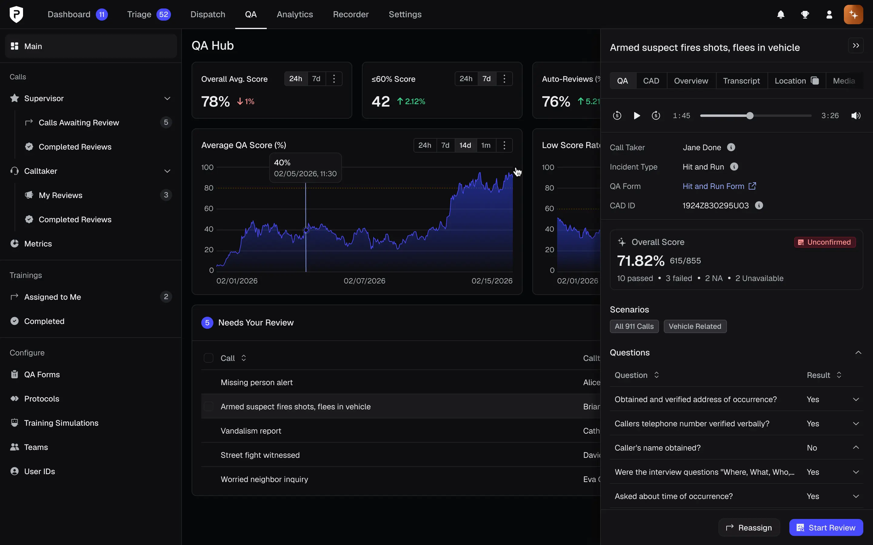
Drawer is tailor-made for use with DataTable for the reasons mentioned above. While users browse, filter, and search on the table, they click on a row that opens a drawer containing details about a particular entity—a recording, a protocol, a user—and in many cases contains a form for making modifications.
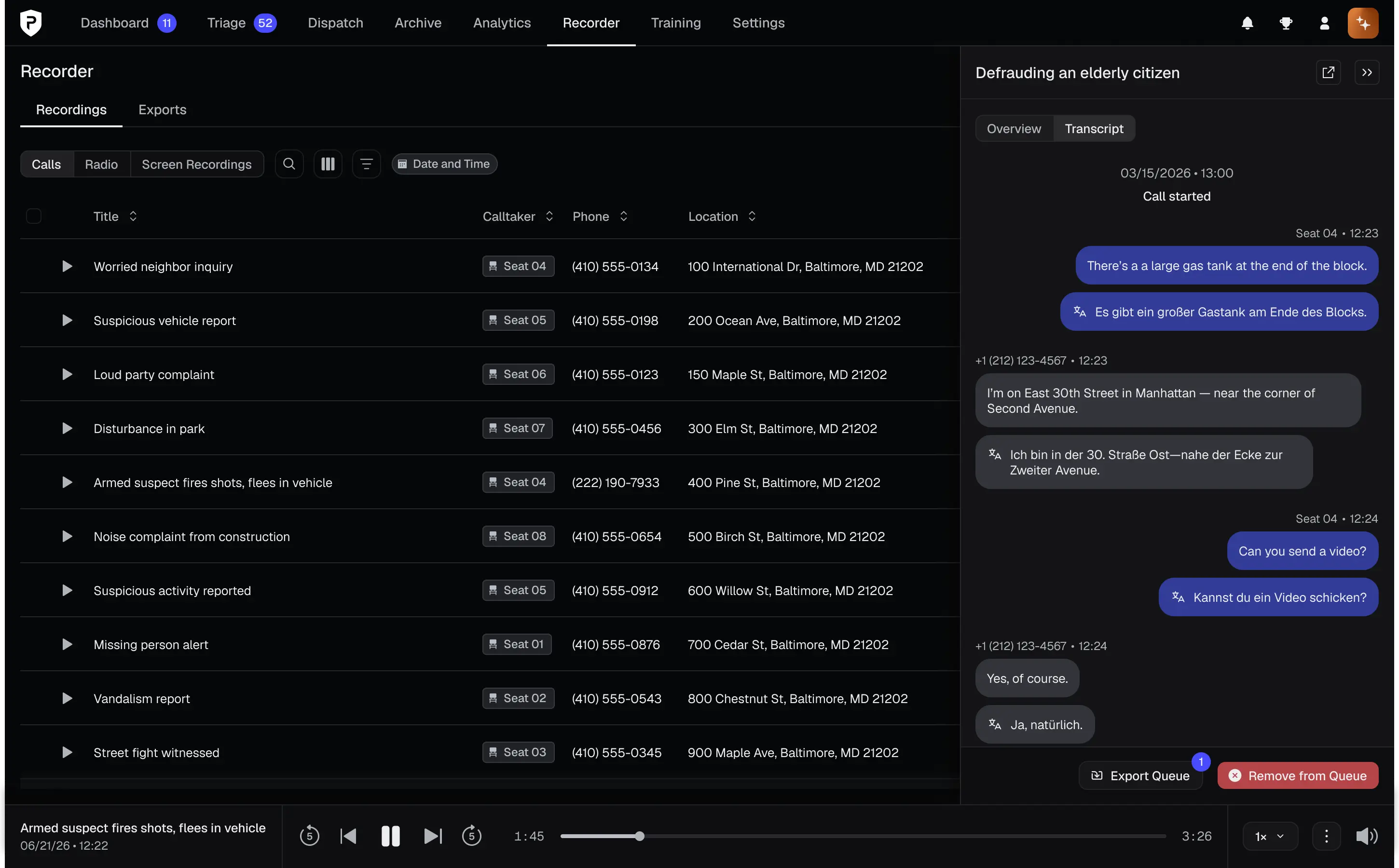
In data-heavy interfaces, where every pixel counts, drawer provides an escape valve through which users can access critical information without leaving their current context.
When abandoning a workflow or deleting an item, Modal is ideal, adding intentional friction by removing the user from the context and requiring that they confirm their intent.
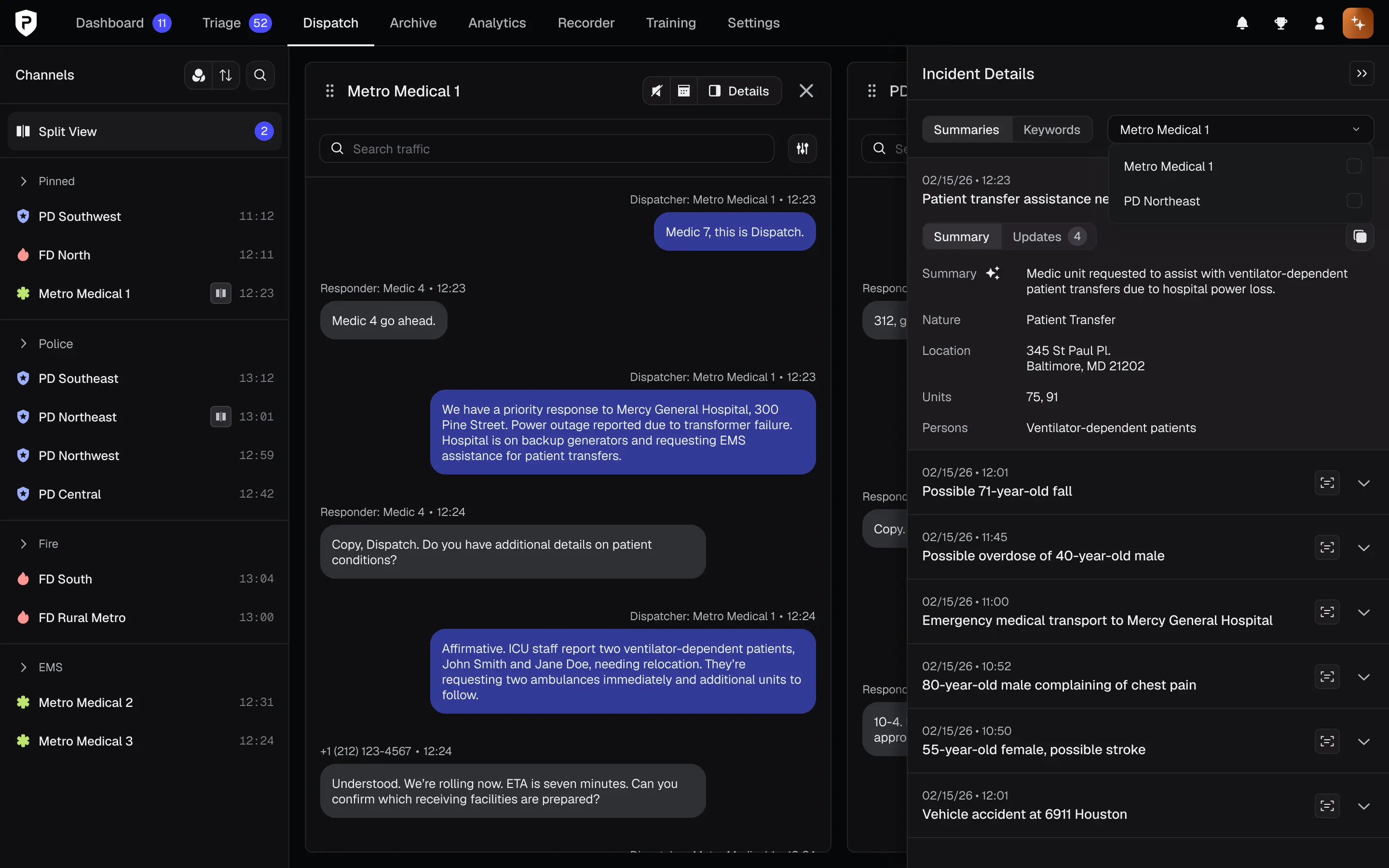
For extended workflows that require viewing multiple sources of information at once, use TakeoverModal. This is especially the case when a workflow is linked to a DataTable. Drawer, in fact, provides a perfect jump off point into a TakeoverModal: the instance of Drawer supplies high-level details with a CTA to enter a workflow in TakeoverModal.
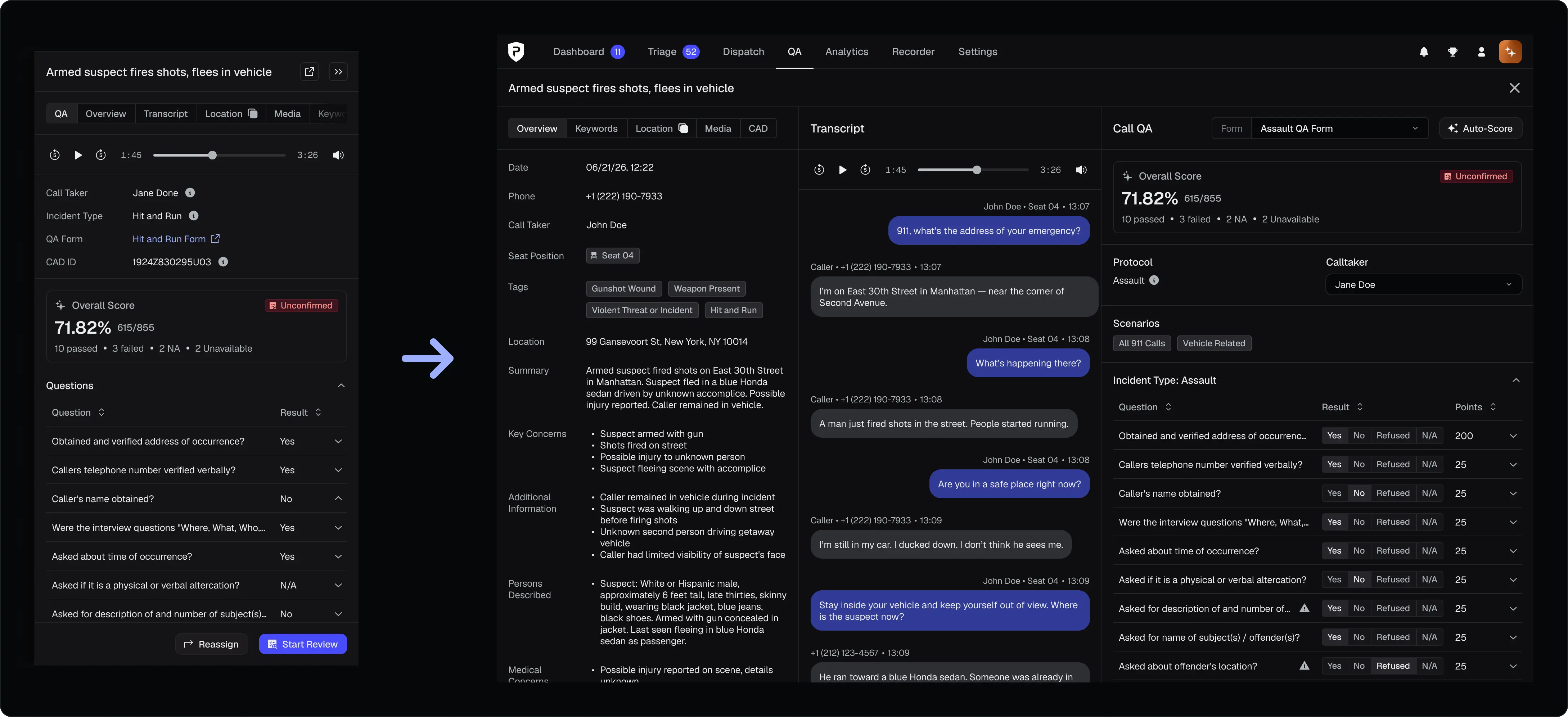
Every drawer should include a header and body, with an optional footer for action buttons. By default, each Drawer section should use padding={2} (16px).
3
Use a descriptive title for the drawer or dynamic content, such as the AI-generated title of a call, if succinct. Use text truncation to prevent overflow.
If a drawer contains a set of items, show a counter to the immediate right of the title. Always use the Default color at the Regular size.
Optionally add a badge to convey status or state to the right of the title and, if used, the counter.
An icon button can serve as an external link when placed to the left of the dismissal button.
Flush right against the side of the drawer header, the dismissal button closes the drawer and should appear with a double chevron icon.
00:00 / 00:00
Call Taker
Jane Doe
Incident Type
Hit and Run
QA Form
CAD ID
1924Z830295U03
Overall Score
615/855
10 passed · 3 failed · 2 NA · 2 Unavailable
Question
Result
Detailed rationale for this step appears here in the live product.
Body contents vary widely based on use case. Some general principles nonetheless apply:
Separators. A Drawer body may contain several sections; each should use borders that span to the edge of the drawer rather than a Separator, which respects horizontal padding.DataList for key-pair values, such as providing metadata about a call (e.g., title, summary, location, etc.).SegmentedControl to split content. If necessary, nest it in a Scrollable to support horizontal overflow—or, better yet, reduce the number of sections.Scrollable to sections with contents likely to overflow available space. Use smallScrollbar to keep the scrollbar narrow and scroll for scrollbarVisibility, such that it vanishes when the user isn't scrolling.Review changes before publishing.
An optional section, the Drawer footer should contain up to two CTA buttons on the right hand side (spaced apart by a gap of 2 , or 16px).
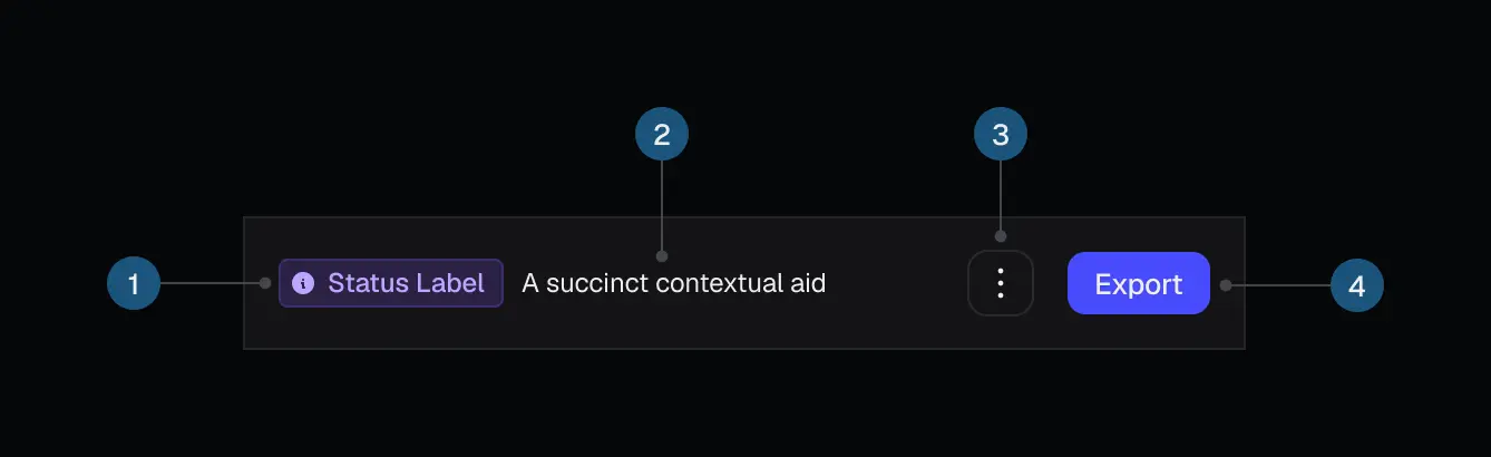
Placed flush left, a Badge can indicate the state of actions in the drawer, such as "draft" or "published." Use sparingly.
More frequently used is informational text, also flush left, with guidance or key information related to the workflows triggered with the CTA buttons.
Although the component supports left and right anchors, the system standard is right-anchored drawers.
Positioned absolutely, a floating Drawer occludes content on the page and must be dismissed to view what it hides. An exception is DataTable: when paired with Drawer, users can scroll horizontally behind the drawer to view each column.
A floating drawer is preferable when used with DataTable and in cramped interfaces.
An inline drawer lives in the normal flow of the DOM. When it appears, surrounding items adjust position and size. Inline drawers can also serve as conditionally visible panels in interfaces with sufficient space.
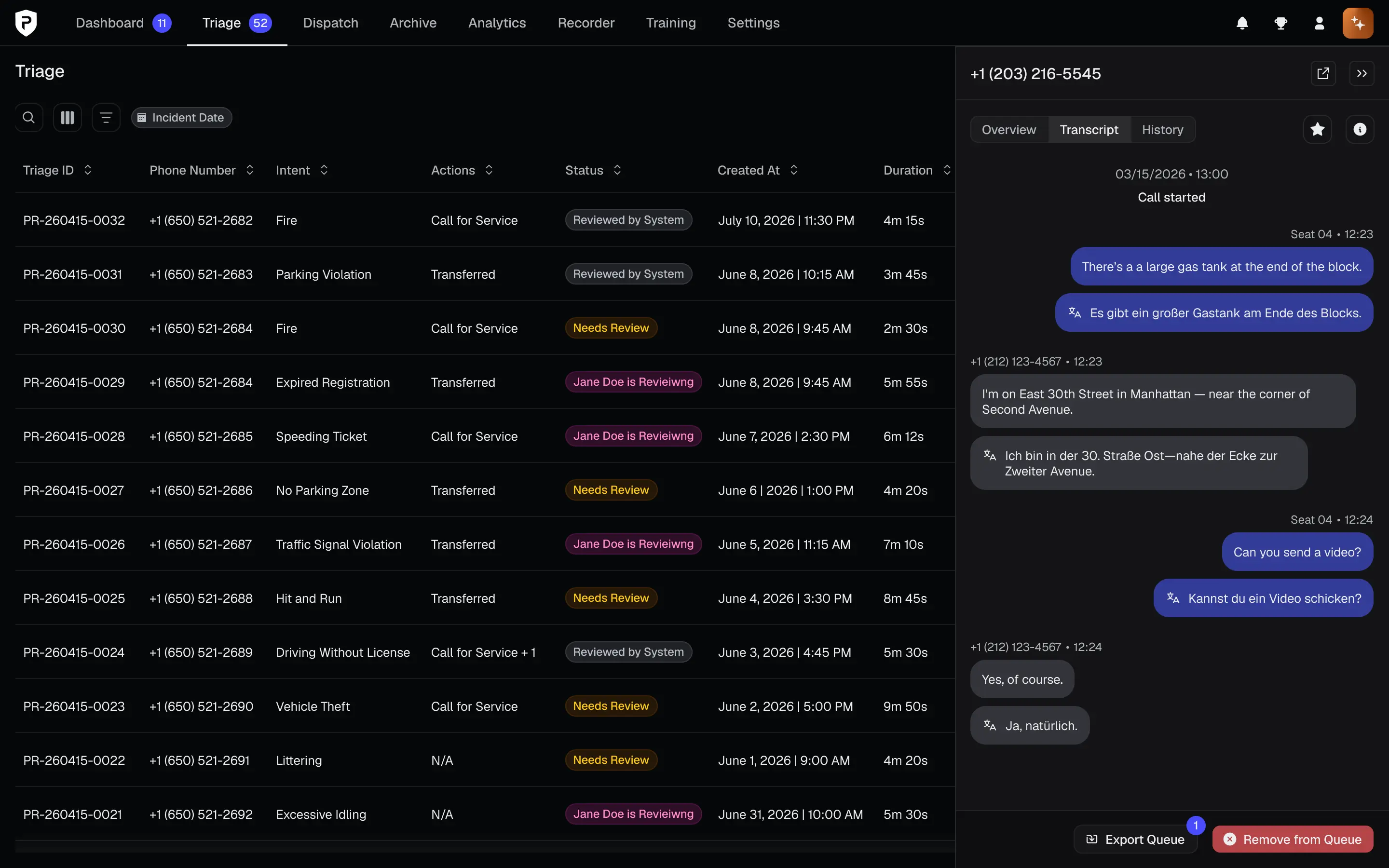
Defaulting to 45rem, Drawer accommodates custom widths between 40rem and 67dvw. Override the default width if the purpose of the drawer is to showcase items of a large size, such as media or maps.
In addition to clicking the dismissal button, users can press the ESC key to dismiss a drawer.
Since auto-saving is generally unsupported, only enable clicking outside to dismiss if a drawer contains informational or read-only content.
On this page